Article
6min
Long seen merely as a formal design exercise, packaging is actually one of marketing's most strategic assets. A thorough contextual diagnosis is the essential starting point for sharp strategic positioning, purposeful design that sparks the right emotion, and ultimately, packaging that delivers real performance.
Packaging is simultaneously the last, perhaps the first, and potentially the only direct touchpoint your brand has with its audience. On the retail shelf, you never get a second chance to make a first impression.
Beyond protecting the product, it has to attract, inform, position, and convert—serving as a true moment of truth in the customer journey. That holds true even post-purchase, guiding product use and unlocking post-sale value.
Packaging leaves the store, joins consumers at home, and settles into their kitchens, tables, fridges, or living rooms. Aside from the product itself, no other marketing touchpoint lives this close to everyday life. Some packs even take on a timeless quality when upcycled or kept as keepsakes marking specific chapters of our lives.
* For Laboratoire Gallia & Vous, Insign designed and rolled out a "pack-to-digital" support service for new parents—unlocked via a unique on-pack QR code—to cement its premium positioning in the category.
This kind of intimacy has to be earned. The retail shelf is one of the most fiercely competitive battlegrounds in business: every brand in a category competes for attention at the exact same moment, in the exact same space. A brand can choose not to run campaigns at the same time or across the same channels as its competitors, but it can’t stop them from sharing the same shelf.
A deep diagnostic of the environment where the packaging must stand out is critical: analyzing category dynamics, shopper behavior, on-and-off-market codes, and most importantly… what experience and emotion the brand needs to deliver to extend the brand journey, spark a connection, and drive the final purchase decision in a space defined by non-stop moments of truth.
1. Does it get noticed?
This is table stakes for everything else. Before it can be understood or loved, packaging has to claim visual real estate. Color, contrast, format, visual weight: it’s all about raw stopping power. We can measure this impact upfront through eye-tracking studies and real-world visibility benchmarks long before finalizing the design.
*For Fresh and Grand Frais, two retail brands that don't rely on national labels, Insign designs packaging built to cut through the clutter of crowded aisles.
The challenge is two-fold: express the distinct positioning of each product line while guaranteeing standout visibility on the shelf. Color selection is pivotal here: it has to catch the eye instantly while driving the right product perception.
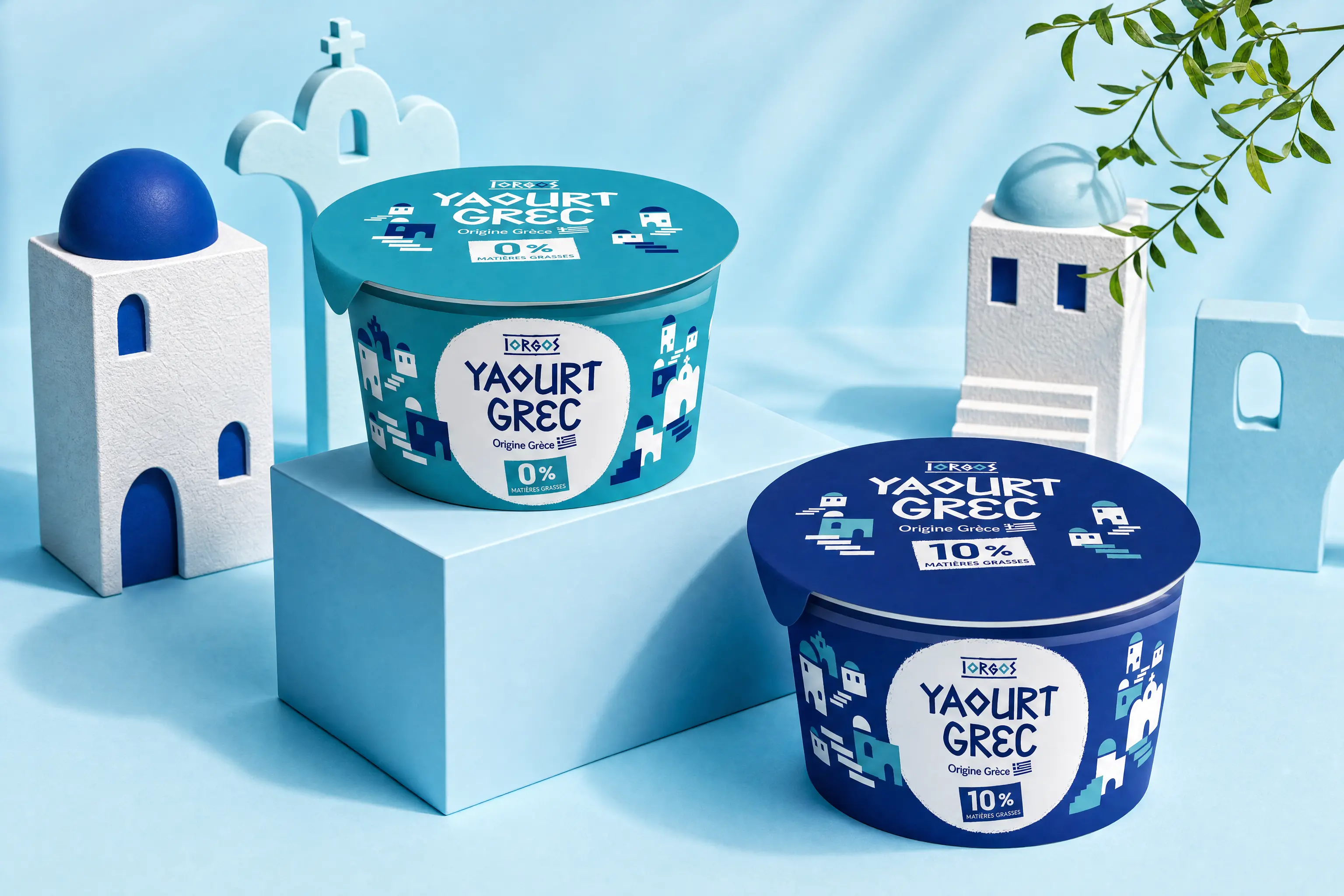
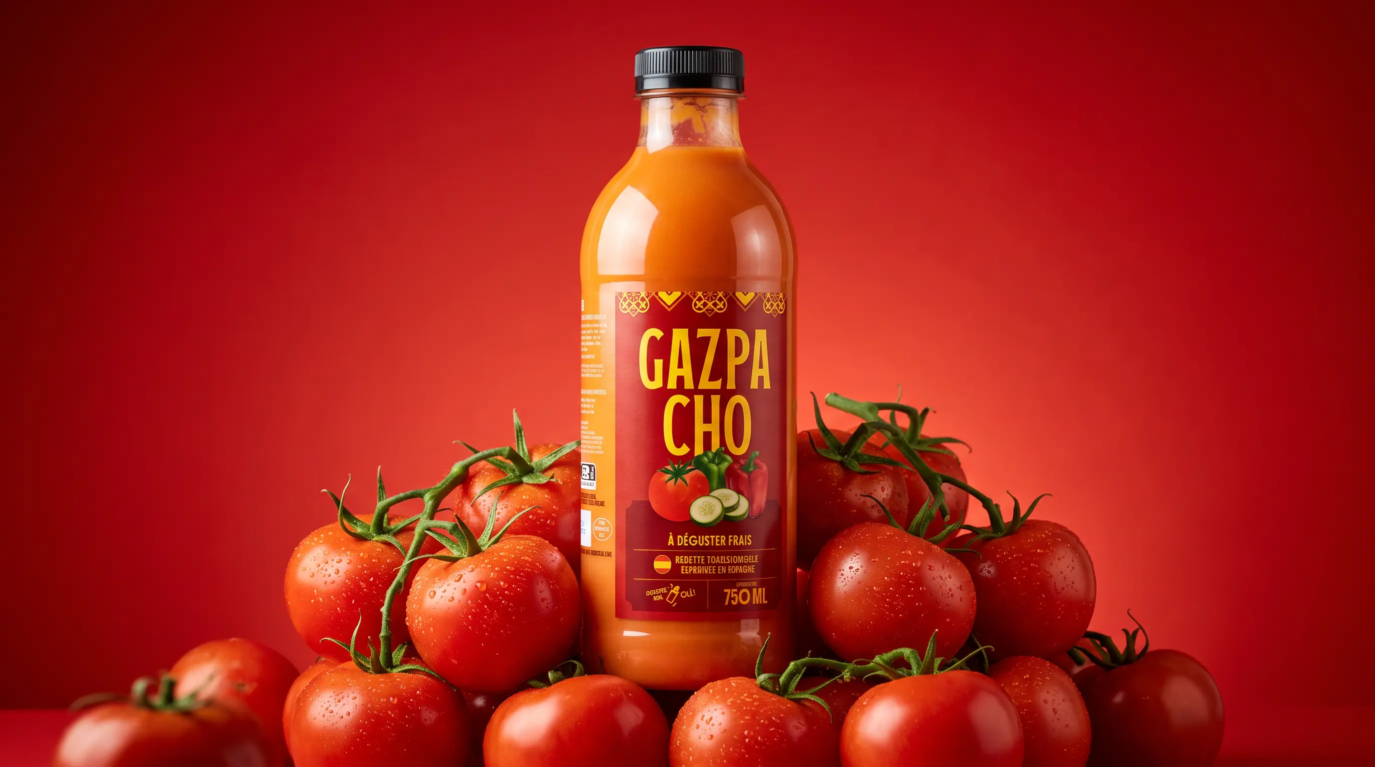
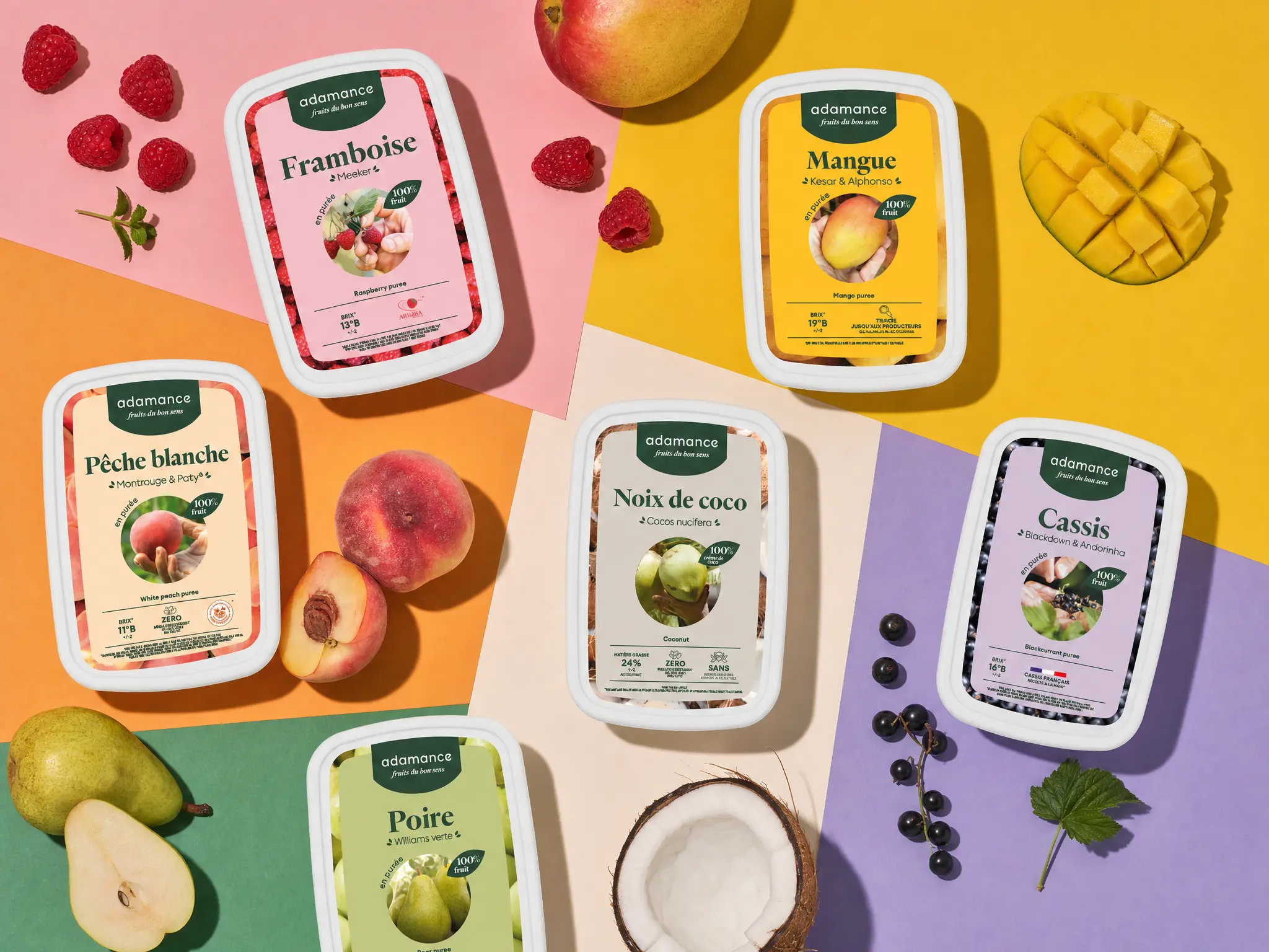
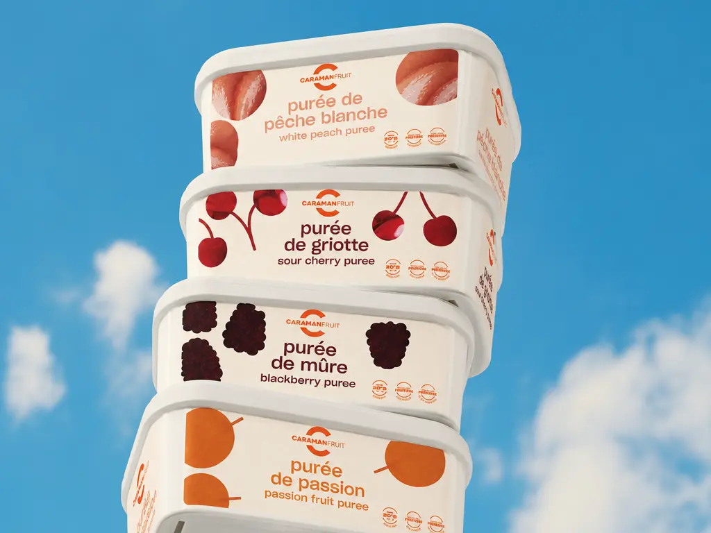
* Behind seemingly rational decisions, emotion plays a massive role in B2B as well. Packaging can spark interest, build preference, and help seal the deal.
In a product catalog—the primary purchasing channel for professionals—the first hurdle is straightforward: grab attention at first glance. That was the guiding principle behind the packaging we developed for Valrhona Group's Adamance and Caramanfruit brands.
2. Does it make sense fast?
A pack that catches the eye but fails to communicate clearly loses its edge instantly. In two to three seconds, a shopper needs to know: who it is, what it is, and why it’s right for them. Visual hierarchy becomes a core strategic choice. Too much information dilutes the message. Readability is a positioning decision.
* For Béaba, drinkable yogurts, and Sana Gaïa, we tailored the information hierarchy to the nuances of each product and consumer expectations. That meant lifestyle imagery to explain usage for Béaba, appetizing illustrations to highlight flavors on Fresh and Grand Frais shelves, and texture cues to introduce Sana Gaïa’s superfoods.
Three distinct approaches serving a single goal: deliver clarity and make the buying decision effortless.
3. Is it cohesive?
This is where projects often trip up. A pack can be eye-catching and easy to read, yet fall short on brand cohesion. Visual codes must align with brand positioning, price point, and category expectations.
A premium brand borrowing discount cues instantly loses credibility—and vice versa. A purpose-driven brand with packaging that contradicts its values immediately breeds skepticism.
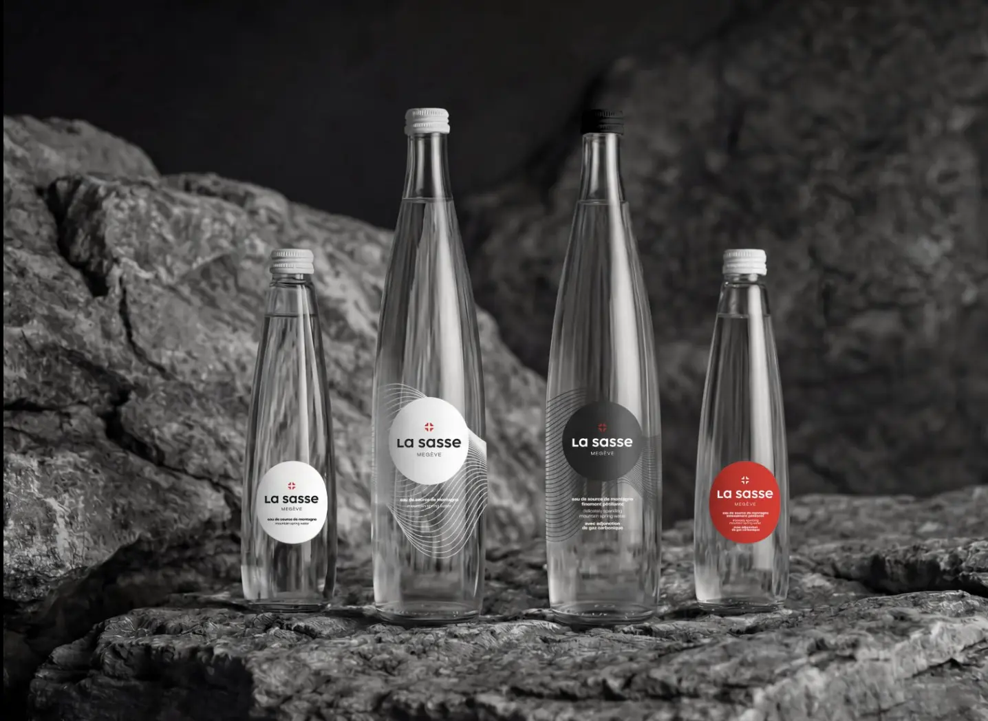
* For La Sasse and Emile Noël, Insign built premium visual identities tailored to two very different worlds.
For La Sasse, the packaging leverages fine-dining cues to earn its place on the tables of top-tier restaurants.
For Emile Noël, it reflects an artisanal standard for organic specialty oils.

In both cases, the packaging captures the unique value of the offering and builds perceived value that reinforces brand positioning.
4. Does it drive preference and conversion?
When a shopper picks up a product, the pack moves closer, gets turned over, read, and scrutinized. Touch registers the materials, and physical weight confirms or challenges initial visual impressions. Does the packaging generate the right emotional pull to close the sale? That’s the ultimate question—and the only one that truly validates the first three.
All else being equal in visibility, clarity, and consistency, what tips the scale? That’s where emotion steps in—an authentic emotion rooted directly in brand identity.
A recent experimental study presented the exact same chocolate in packs varying by color, texture, scent, and opening mechanism. Researchers noted significant shifts in self-reported emotional responses.
Certain combinations triggered higher levels of admiration, joy, desire, or pride. How the pack opened also directly influenced perceived attractiveness, expected price point, and willingness to pay.
Packaging sparks an emotional response that shifts perceptions of quality, desirability, luxury, or trust. From there, it shapes trial intent, brand preference, purchase intent, price tolerance, word-of-mouth, and brand recall.
We test packaging in real-world retail conditions and iterate relentlessly. This back-and-forth between field insights and design allows us to validate, refine, and deliver packaging with proven commercial impact. We love this challenge precisely because it’s demanding. It requires balancing competing priorities: making an impact without being aggressive, staying credible without being boring, standing out without confusing the category, and looking stunning without sacrificing genuine emotional resonance.