Aquachiara
Repositioning Aquachiara to better connect with its two key markets
Brand
Food
#brand platform #brand strategy #design system #brand architecture #go-to-market
↳ Context
As a pioneer of microfiltered water in France, Aquachiara was entering a new phase of growth.
With backing from an impact investment fund, the brand needed to structure its organization to support its growth ambitions, build clearer market visibility, and better target two key sectors with very distinct needs: Hospitality and Corporate.
↳ Challenge
Standing out in a crowded market where water is still too often viewed as a simple commodity, especially in France.
↳ Strategy
Establish a clearer, more distinctive brand position for Aquachiara centered around a simple belief: giving more value to what keeps us alive. Water is no longer presented as a commodity, but as a hallmark of quality, care, and experience.
↳ Two brand pillars
Structuring the brand around two core differentiators—design and service:
Design to optimize usage, integration, and desirability.
Service to embody support, customization, and seamless operations.
↳ A clearer brand architecture
Clarifying the segmentation between Aquachiara Hospitality and Aquachiara Corporate under a single brand vision, while tailoring the benefits and messaging to each target market.
↳ A premium creative space
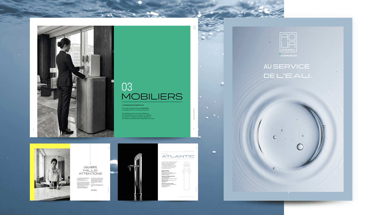
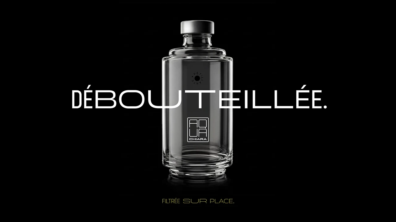
Establishing a visual identity built on precision, light, and clean lines, where each water dispenser is showcased as a piece of designer furniture.
A sophisticated, understated voice designed to elevate the brand's profile and make it stand out.


↳ Deliverables
↳ A comprehensive brand platform: "Giving more value to what keeps us alive"
Customer and internal interviews.
Strategic workshops using our proprietary Socle (“Foundation”) and deployment methodology.
Formalization of brand pillars and core messaging principles.
↳ A scalable brand architecture
Definition of different architecture scenarios.
Tailoring messaging, benefits, and proof points to target audiences.
↳ An actionable brand identity & style guide
Creation of the global visual identity: logo, design system, and comprehensive brand guidelines (print and digital).
Sales enablement tools.
Press kit and press releases.
This project helped us clarify what makes AQUACHIARA stand out, while fine-tuning our messaging for our two key markets—hospitality and corporate. Insign helped us build a brand platform that is clearer, more distinctive, and above all, easier to leverage for sales. The work we did on brand architecture, messaging, and our design system now gives us a solid framework to better reach our target audiences with tailored proof points and messaging for each. Beyond the repositioning, this project had a real impact internally: it aligned our teams around a shared vision and gave us the hands-on tools we need to accelerate our growth.
Laurence Faye,
Chief Marketing & CSR Officer and Communications Director, AQUACHIARA